HAWTHORN
×
HAWTHORN ×
Project Overview
BUILT FOR FUN. SHARP AS A THORN.
Welcome to Hawthorn, a NOBLE project that’s not in the real world, but very real in our hearts and minds. With no client brief, no approval rounds, and no one telling us to make the logo bigger, we simply let loose on a brand from the ground up. We used Hawthorn as a sandbox to push our capabilities in brand identity, digital design, merchandise, and print. And of course, to remind ourselves (and you) what Noble looks like when we create without boundaries.
BRAND IDENTITY
BRAND ARCHITECTURE
BRAND ASSETS
WEB UI Design
Merchandise Design
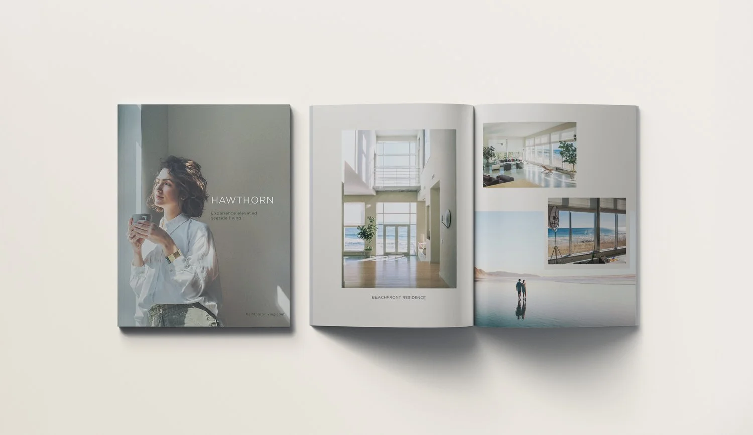
PRINT & EDITORIAL COLLATERAL
NOBLE IDEAS
WHEN THERE'S NO CLIENT, THERE ARE NO LIMITS
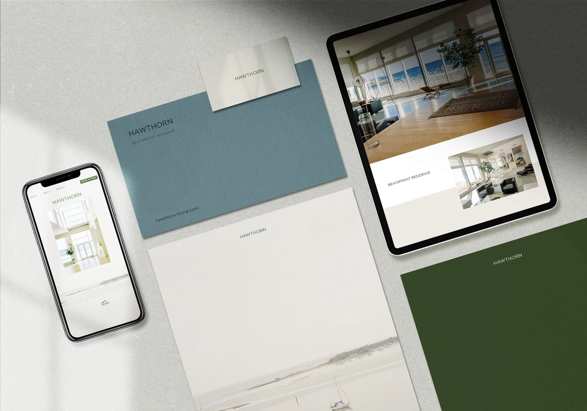
The Hawthorn brand was built around quiet confidence, the kind that doesn't need to announce itself. We anchored the visual identity in a muted, natural palette offset by sharp typography and clean spatial layouts, creating a brand that feels both premium and grounded.
The web UI concept centres on editorial restraint: large-format imagery, deliberate whitespace, and a navigation system that trusts the user. We designed the digital experience to feel like flipping through a beautifully art-directed magazine, where every scroll reveals something worth stopping for.
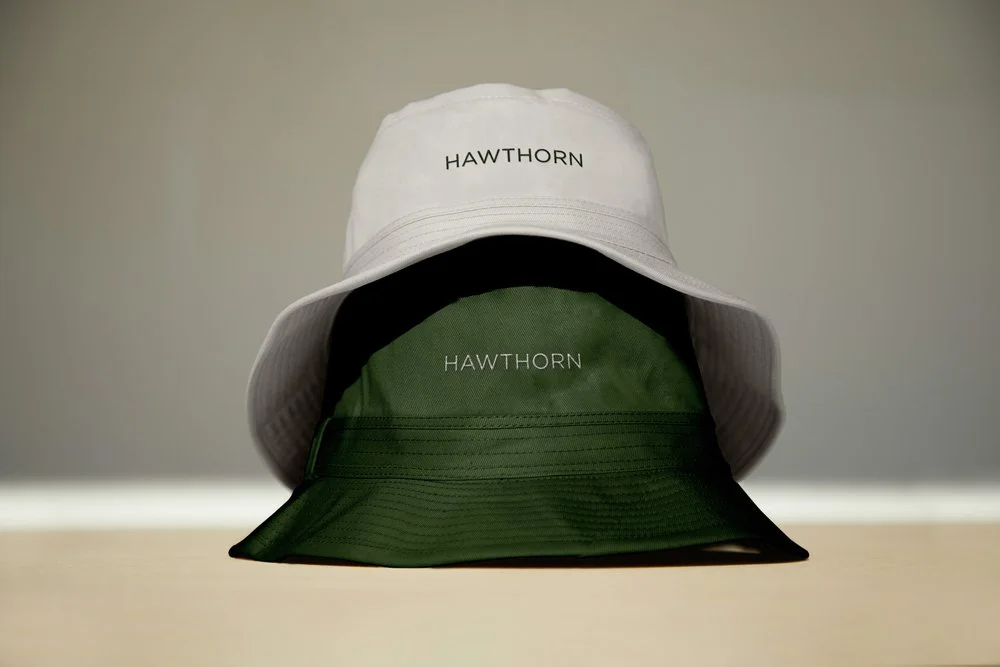
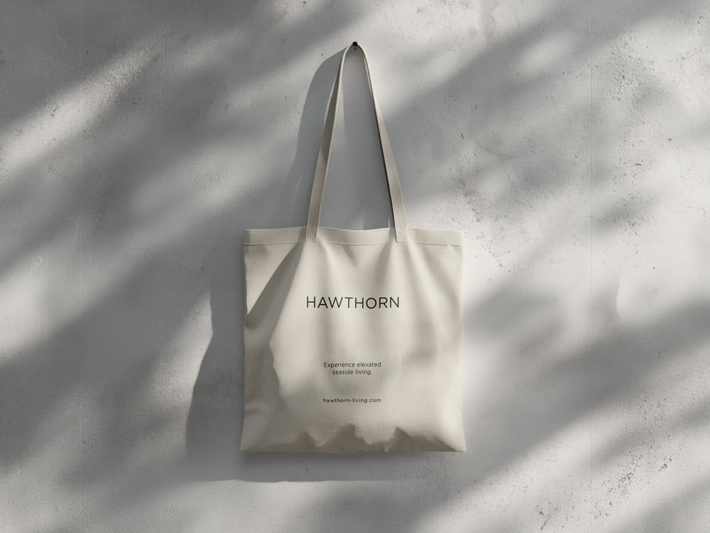
Merchandise extended the identity into the physical world, with a bucket hat and tote that prove a great brand lives just as comfortably off-screen as on. The print collateral rounded out the suite, giving Hawthorn the kind of tactile credibility that clients would have been lining up to brief.
The result? A portfolio piece that does the work of a full brand launch, because at Noble, even our spec work is built for glory.